Tabs
Group content into switchable tabs with optional variants
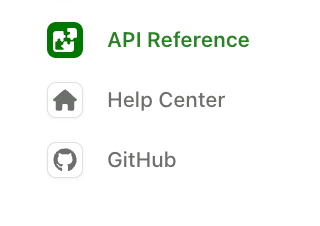
Tabs split a product or version into parallel bodies of content, each with its own sidebar. Tab variants give a single tab more than one version of its content, such as REST versus GraphQL or beginner versus advanced.
Two tabs make sense when the content is unrelated, like guides and an API Reference. Variants of one tab make sense when it covers the same ground for a different reader.
Tabs
To configure tabs:
- Declare each tab under the top-level
tabskey with adisplay-nameand anicon. - Reference the tab in
navigationwithtab:. Each tab requires either alayoutfor its content,variantsfor tab variants, or anhrefpointing at an external URL.
Tab icons
Icons can be in three formats:
- Font Awesome icons: Use icon names like
fa-solid fa-rocket. Pro and Brand Icons from Font Awesome are supported. - Custom image files: Use relative paths to image files (e.g.,
./assets/icons/my-icon.svgor../assets/icons/my-icon.png). Paths are relative to the YAML file where the icon is referenced (e.g.,docs.yml). For example, if you set an icon infern/products/my-product.yml, the path./assets/icon.svgresolves tofern/products/assets/icon.svg. If you set it infern/docs.yml, the same path resolves tofern/assets/icon.svg. - Inline SVG: Provide an SVG string wrapped in quotes (e.g.,
"<svg>...</svg>").
Tabs placement and styling
Tabs display in the left sidebar by default. Use theme.tabs to control placement, style, and alignment.
Tab properties
display-name
The name shown in the tab header
icon
Icons can be in three formats:
- Font Awesome icons: Use icon names like
fa-solid fa-rocket. Pro and Brand Icons from Font Awesome are supported. - Custom image files: Use relative paths to image files (e.g.,
./assets/icons/my-icon.svgor../assets/icons/my-icon.png). Paths are relative to the YAML file where the icon is referenced (e.g.,docs.yml). For example, if you set an icon infern/products/my-product.yml, the path./assets/icon.svgresolves tofern/products/assets/icon.svg. If you set it infern/docs.yml, the same path resolves tofern/assets/icon.svg. - Inline SVG: Provide an SVG string wrapped in quotes (e.g.,
"<svg>...</svg>").
slug
Custom URL slug for the tab
skip-slug
Exclude the tab slug from URLs
hidden
Hide the tab from navigation. See Hiding content for details.
layout
Navigation structure for the tab’s content. Required unless the tab uses variants or href.
variants
List of tab variants. Use instead of layout.
href
External URL. When set, clicking the tab redirects to this URL. Tabs with href must not include layout or variants.
target
Where the link opens. One of _blank, _self, _parent, or _top.
changelog
Path to a changelog folder, relative to the YAML file where it is set (e.g., docs.yml)
viewers
Role-based access control for the tab
orphaned
When true, roles don’t inherit from parent elements
feature-flag
Conditional display configuration
Tab variants
To add variants to a tab:
- Replace the tab’s
layoutwith avariantslist. The declaration undertabs:doesn’t change. - Give each variant a
titleand its ownlayout.
Variants support RBAC, so a variant can be limited to readers holding a given role.
Variant properties
title
Display name for the variant
layout
Navigation structure using the same format as regular tab layouts
subtitle
Text displayed below the variant title
icon
Icons can be in three formats:
- Font Awesome icons: Use icon names like
fa-solid fa-rocket. Pro and Brand Icons from Font Awesome are supported. - Custom image files: Use relative paths to image files (e.g.,
./assets/icons/my-icon.svgor../assets/icons/my-icon.png). Paths are relative to the YAML file where the icon is referenced (e.g.,docs.yml). For example, if you set an icon infern/products/my-product.yml, the path./assets/icon.svgresolves tofern/products/assets/icon.svg. If you set it infern/docs.yml, the same path resolves tofern/assets/icon.svg. - Inline SVG: Provide an SVG string wrapped in quotes (e.g.,
"<svg>...</svg>").
slug
Custom URL slug for the variant
skip-slug
Exclude the variant slug from URLs
hidden
Hide the variant from navigation. See Hiding content for details.
default
When true, this variant displays by default. If not specified, the first variant in the list is used.
viewers
Role-based access control for the variant
orphaned
When true, roles don’t inherit from parent elements
feature-flag
Conditional display configuration